The first step
My mission to publish my novel as an eBook has started with a simple step–read as much as I can on the subject! To that end I have started to read “Let’s Get Digital” by David Gaughran. So far I’m part of the way through the section where he outlines why digital dominance is inevitable, and why print media is doomed (and far more imminently than I originally thought). It’s sobering material, but has served to make me more convinced than ever that my decision is the correct one.
Print is doomed. Much as I love physical books, especially quirky second-hand bookshops, none of us can afford to be too sentimental about this–we have to be ready for the future.
So while I read the book, I’ve been experimenting with cover designs. Most of the more successful eBooks have had their covers done by a professional, but a large number of authors are now choosing to do the design work themselves. The results can be dreadful, but they can also be very good, and I want to explore this option before committing myself to paying a graphic designer.
I have a number of requirements for my cover:
- Most importantly, it must convey the necessary information in a clear and concise manner at a number of different scales, from thumbnail to large format eInk screen.
- It must have high contrast.
- It must be striking. It must draw the reader to the book and make them want to read it.
- It must accurately convey genre and tone (a surprisingly subtle matter, when you really think about it).
- It must feature an iconic image, quintessential to the soul of the book.
Here is my first attempt:
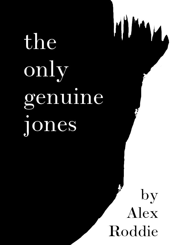
The image appeals to me for a number of reasons. It has contrast and simplicity; it has a striking image absolutely quintessential to the story (Jones’ team approaching the Ice Trap); it renders reasonably well on an eInk screen.
However, the climbing figures are minute, and cannot be clearly discerned on the screen of a Kindle (forget about a thumbnail image). Without the figures to give scale and context to the image, the rest of it is just a wiggly line.
Secondly, the font, while appropriate in some respects, is not bold enough to be clear when viewed at small sizes. Scotch Roman is a Didone typeface with big contrast between broad and narrow strokes. Much as I love Didones, it’s not appropriate here.
And here’s another go:
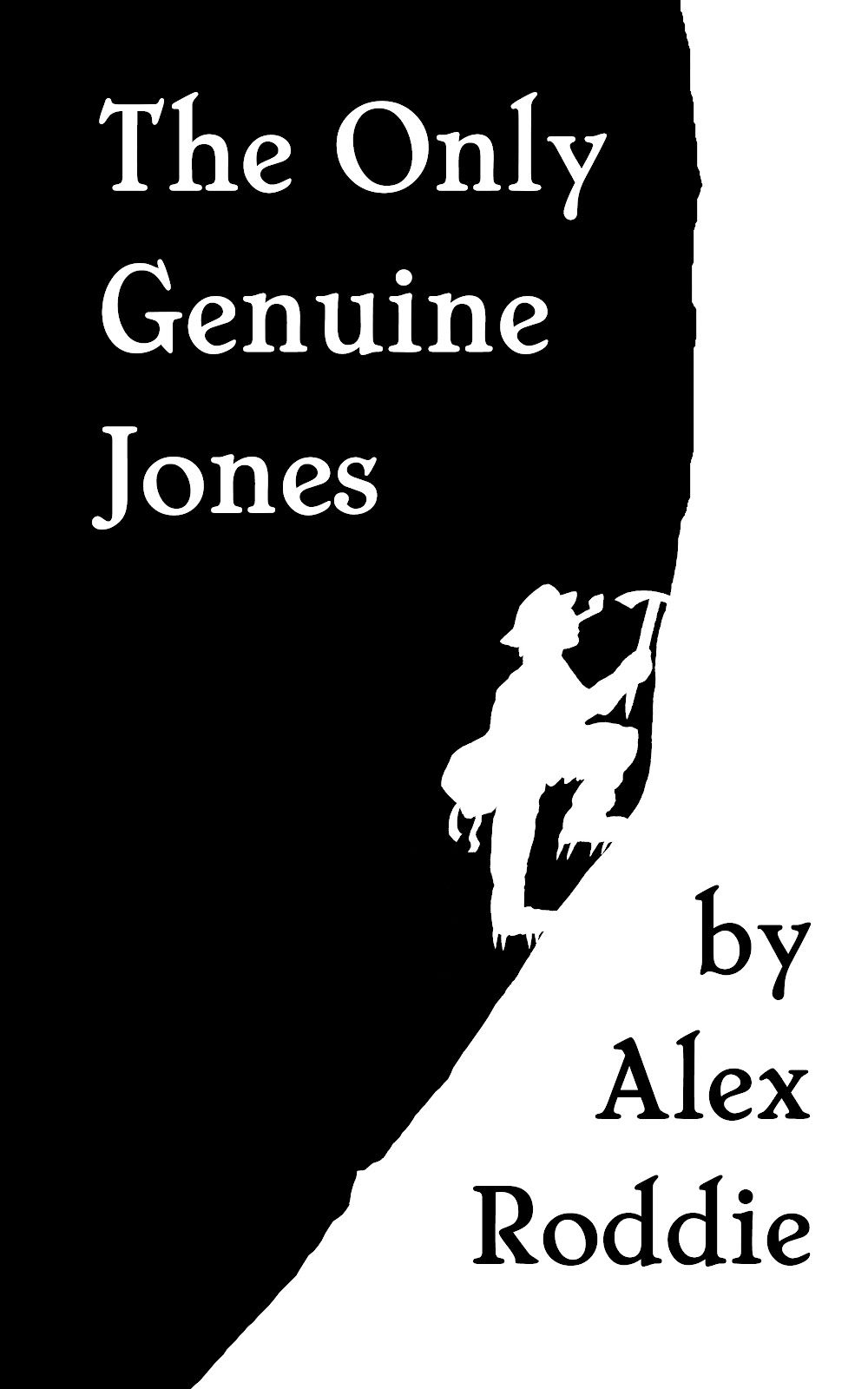
A definite improvement, with greater clarity of text (while maintaining the necessary period feel). The image is just as iconic–although I couldn’t find a way of including the icicles in this one without sacrificing simplicity. I’ve been able to give the climber far more character than the tiny figures in the previous cover. The hat and pipe instantly convey to the reader that this is a period novel, while the crampons and ice axe tell the informed reader a little more.
Even someone with no knowledge of climbing whatsoever can clearly see that this is an ice climber, alone at the foot of a wall of ice, preparing himself for the challenge above. I think this is a suitable microcosm of my entire story, and sums up Jones’ questing character perfectly.
Will I use this as my final cover design? Probably not–and I’m still strongly considering getting something more professional made by someone who actually knows what they’re doing. But I think it’s an important stage in the process, as now I have something real I can visualise when I think of my novel as an eBook.
All images (C) Alex Roddie 2012, All Rights Reserved.

Alex Roddie Newsletter
Join the newsletter to receive the latest updates in your inbox.