“Crowley’s Rival” takes shape. Plus: cover designs!
Crowley’s Rival is my current work in progress, and I’m glad to report that I am (just about) on track for a late December release. When finished it’s going to be a short work, somewhere between a short story and novella in length, depending on your definitions; I am aiming for no more than ten thousand words.
This story has several purposes. Firstly, fans who have read The Only Genuine Jones are keen for more material starring their heroes. Although I have planned a full-length sequel (La Dent Noire),work will not begin on it for at least a year so it’s only right that I produce some shorter pieces to fill in the gaps! Secondly, an author cannot thrive on a single released title. With multiple titles, sales of one will help the other, and I can use a variety of pricing and sales strategies.
I have no intention of ever pricing any of my full-length novels for free, as I think it will eventually harm authors, despite short term gains in popularity for individual books. However, I can and will be running free promotions on shorter works. It’s a great way of finding new readers who will devour a short story in one or two sittings, then look to see what else that author has produced if they enjoy it.
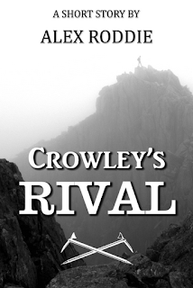
Although the first draft is not quite finished, today I have been busy designing a cover–I find it helps me to visualise the story as a finished product if I have a cover I can be proud of! Due to the fact that this one is going to be a shorter piece, I have decided against professional cover design. This was always going to be DIY job.
My first design was typographically questionable to say the least:
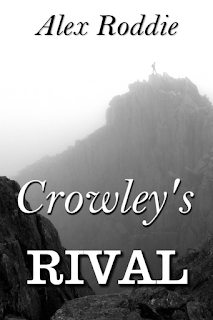
After some feedback on Facebook and Twitter, I made some modifications to the fonts (although I will continue to use Clarendon–the bar serif typeface used for “RIVAL”–as it fits in well with my overall styling). My second attempt was a little better:
I experimented with adding Victorianesque border pieces, flourishes and so on, but decided to get rid of them. I seem to be suffering from a branding problem and am keen to draw more historical fiction fans to my work; everything about my online presence is designed around climbers, mountaineers, and other ‘outdoorsy’ types, but there’s very little to showcase the 19th Century historical background to my novels. I thought perhaps making the cover a little more Victorian might help, but consensus was that the flourishes were dreadful, so I got rid them.
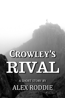
My final design is the version you see at the top of the page, but I really am undecided which is better. On one hand, I like the crossed axes motif; on the other hand, the second design (directly above) is simpler. What do you think?
Last but not least, The Only Genuine Jones has received its EIGHTH 5* review on Amazon! Read it here.
Alex Roddie Newsletter
Subscribe here to receive my occasional personal newsletter in your inbox. (For the fun stuff, please consider subscribing to Alpenglow Journal instead!)


